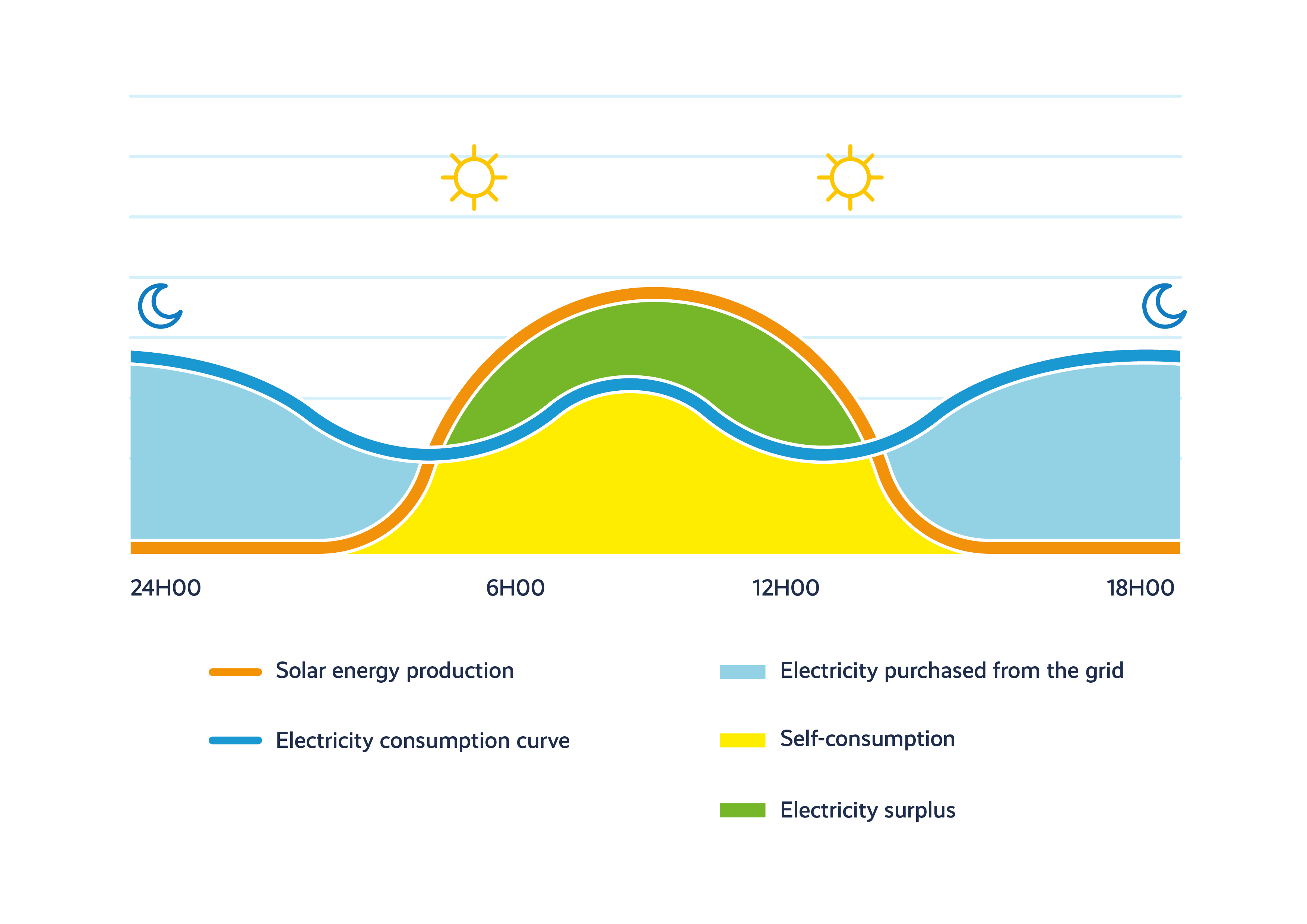
This diagram illustrates the period of solar electricity surplus and peak household consumption over a full day in a residential setting.
Curves and areas shown:
- The orange line represents electricity consumption. This curve shows three peaks during the day: in the morning, at lunchtime, and especially in the evening after 6:00 PM.
- The blue line represents the level of solar electricity production. Between around 8:00 AM and 6:00 PM, photovoltaic production increases significantly, exceeding household consumption.
- The dark blue hatched area shows self-consumption, which occurs approximately between 6:00 AM and 6:00 PM.
- The light blue area represents the surplus solar electricity fed back into the grid or stored in a battery. This period corresponds to daylight hours.